Stroll Health
Research and UX design on scheduling and calendar feature to bring transparency and efficiency to the patient referral system
The Challenge
Scheduling and calendar feature for radiology clinics to edit availability and appointments
My Role
Project Lead, working with 5 designers
(Led and contributed to: Research, lo-fi, hi-fi, and validation testing)
Timeframe
10 weeks
Overview
Stroll Health asked us to redesign their calendar and scheduling feature for radiology clinics - an enormous challenge that required careful understanding of user needs and in-depth research into current healthcare systems for patient referrals. I led design through problem scoping, research, design, and testing. Our deliverables to the client included research on the target group, high-fidelity mockups, and a style guide.
Our redesign will be developed in summer 2017.
Select High-Fidelity Screens
The Challenge
Stroll Health's mission is to help doctors and patients make effective choices towards better-value care, and that starts with a more transparent referral and appointment scheduling process. So, Stroll asked our team to improve their scheduling and calendar feature for radiology facilities.
A streamlined scheduling system would benefit both radiology clinics and the patients they care for. Patients could choose a facility that is right for them and make appointments instantaneously. Radiology staff could spend less time on scheduling and focus more on providing better patient care. Ultimately, making scheduling as simple as possible results in more patients getting medically necessary care.
The original Stroll Health platform - our starting point!
Research & Discovery
Because we were initially unfamiliar with the healthcare space, it was critical to do research so that our team could have a shared understanding of the challenges that schedulers at radiology clinics face.
(Proto) Personas
We created proto-personas of the user to identify our assumptions and knowledge gaps. This became a live document that was validated and updated to reflect our increased understanding as we uncovered insights through user research.
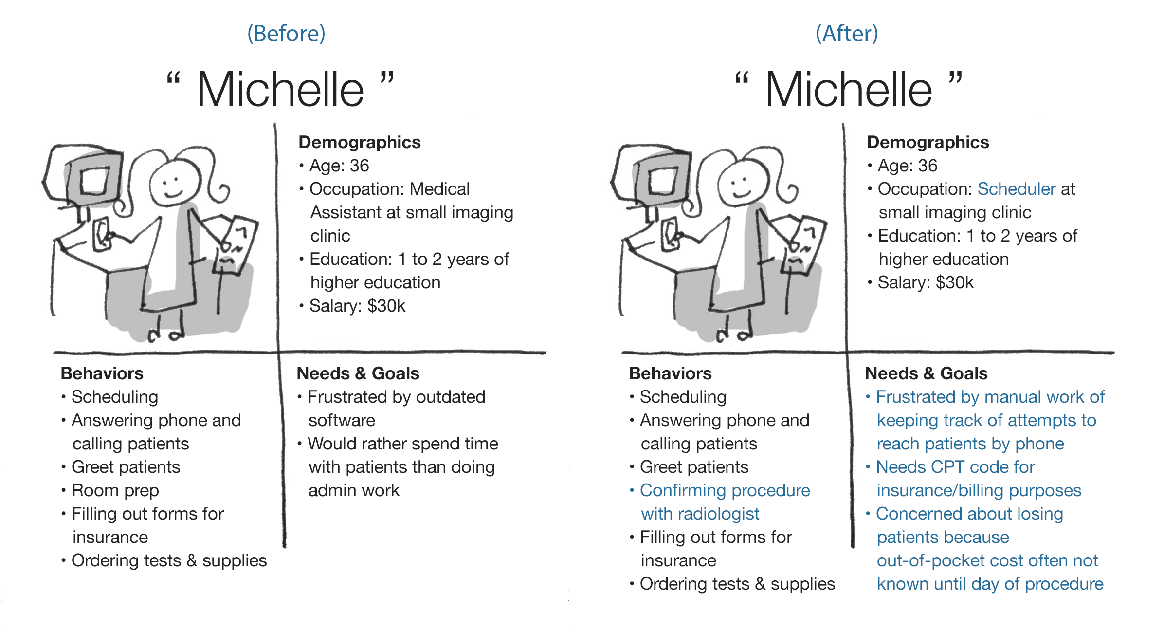
Progression of our user personas. We updated these personas as we learned more through research.
Competitor Analysis & Usability Testing
To identify areas of improvement, my team and I looked at what competitors were doing to see what works well and what doesn't. We also tested the current Stroll platform on 5 participants.

Synthesizing usability testing results
Ongoing User Research
We talked to schedulers at imaging centers and radiology groups to learn more about how they currently indicate availability and receive appointments. Because users were difficult to schedule, interviews were conducted on an ongoing basis throughout the design process.
User Journey Mapping
To solidify our understanding of the patient referral process and current points of friction, I directed my team to map out the referral process from the patient and scheduler's point of view.
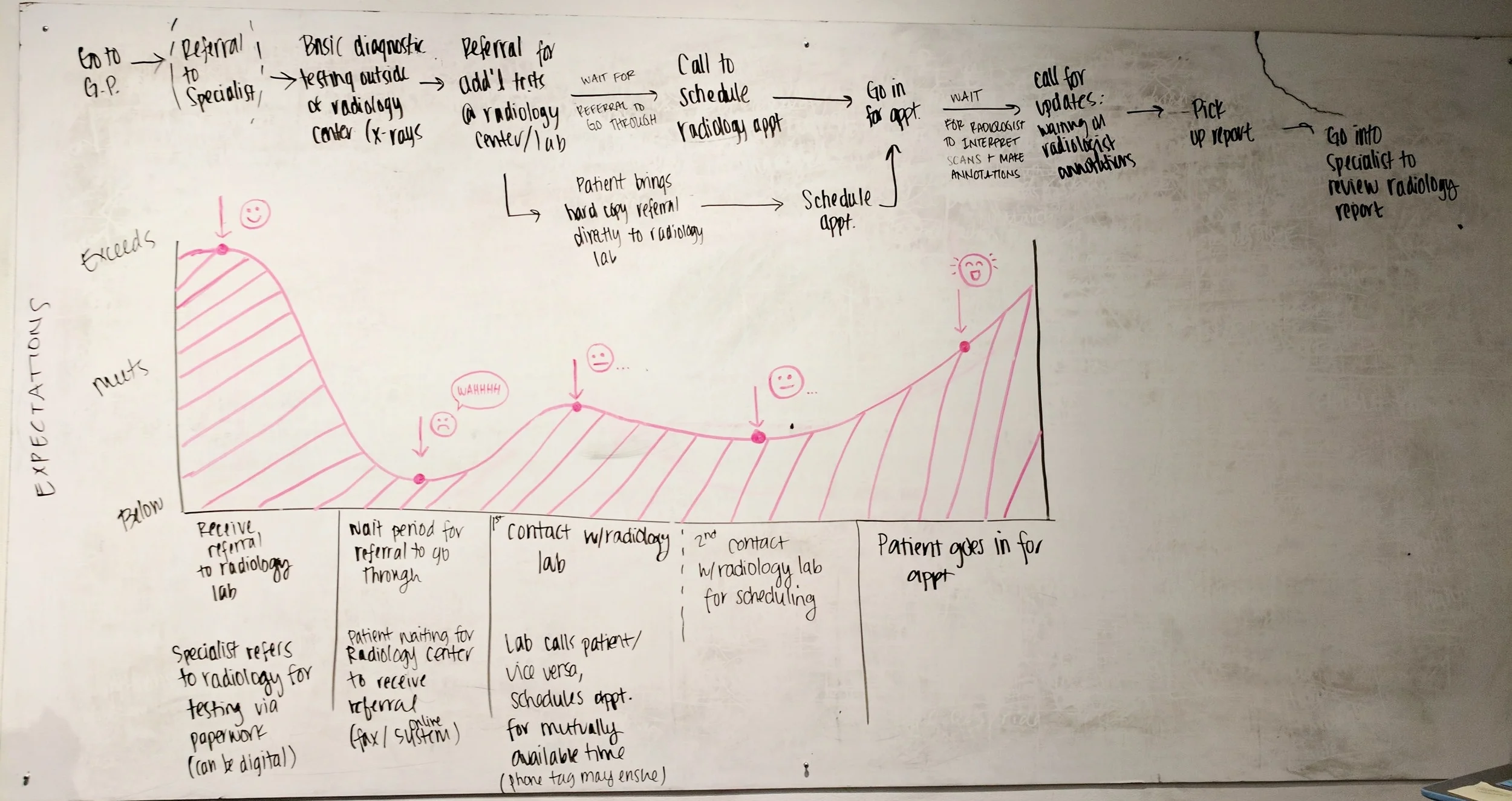
Customer journey map for patients
Ideation & Lo-Fi Prototyping
Sketching: Exploring ideas and alternatives
We sketched, critiqued, refined ideas, selected the strongest design elements, and repeated.


Wireframing & Low-Fidelity Prototype
We turned our sketches into wireframes and a clickable prototype that we could test with users. Here are some of the design decisions we made:
Validation Testing & Iteration
I directed my team to run usability tests on the lo-fi prototype. The results showed that our prototype solved 4 out of the 6 pain points we tested for, but there were two more kinks to work out:
1. Users were confused about whether or not they were in "Edit Appointment Mode" or "Edit Availability Mode".
2. Users didn't like that there were so many filters to go through (choosing facility, modality, and contrast) before a machine could be selected.
We focused on improving these pain points in our next iterations:


High-Fidelity Prototype
The team collaborated on design by splitting the work by component. I was specifically responsible for making pixel-perfect adjustments to each screen and putting together the final interactive prototype that we handed over to Stroll Health.
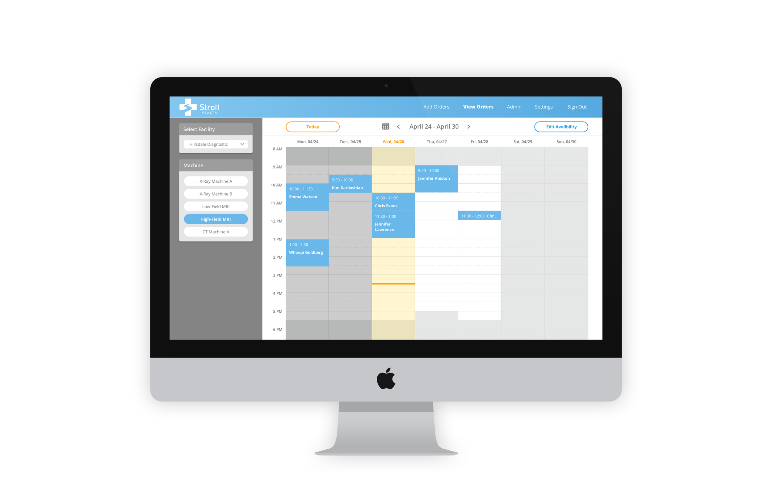
Main calendar view (Appointments)
Editing availability, hover over Wednesday block
Final Deliverables
40+ screens in a Sketch file
InVision interactive prototype
Style Guide

Sketch screens

A sample of the style guide
Conclusion
Leading a team of 5 on a critical and complex feature was challenging, but I took away some important lessons on design and leadership:
Component-based design: Designing by components required more collaboration and communication at the beginning, but resulted in better consistency and easier changes down the line.
Incorporating research throughout iterations: Because of the challenges of scheduling users for interviews, we were forced to be creative with the research process. We kept track of unvalidated assumptions as we designed, then pivoted as we learned more.
Managing a large scope and large team: Clear communication and documentation (through meeting notes, a Trello board, and Slack) was used to make sure all team members were on the same page, even as old members rolled off and new members rolled on in the middle of the project.
Syncing with a parallel project: Another design team was tackling a separate feature for Stroll at the same time, which required good communication to ensure that our designs remained consistent.