Benchling Analysis: Making meaningful sense of experimental data
What
No-code charting and data transformation tool for scientists to understand and visualize assay results
Who
Lead Product Designer, working closely with a PM and Engineering team
When
2023 (product launched June 2024)
The Problem
Benchling is the leading cloud platform for biotech R&D. Scientists use it to plan experiments, collaborate with teammates, and record structured data from their work. But there was a critical gap in the workflow.
After running experiments, scientists need to clean up, process and analyze raw data from instruments (for example, by reshaping data, doing linear regressions and curve fitting) in order to produce meaningful answers to experimental questions that guide the next round of experiments.
Insights Dashboards is a powerful tool, but requires users to write SQL, which doesn’t match the preferences and capabilities of a lab scientist.
We offered an existing analytics tool, Insights Dashboards, but it required users to write SQL queries to extract data from Benchling. Most lab scientists don't know how to write SQL, so this tool was inaccessible to our core user base. Instead, they had to rely on other software (Excel, JMP, Prism) or cumbersome workarounds just to create simple charts. This meant:
Fragmented workflows and lost time on data wrangling
Multiple sources of truth (and version control headaches)
Breaking Benchling's core promise as a unified platform
The opportunity: What if scientists could go from raw experimental data to meaningful insights, all in one place?
In 2024, we launched Insights Analysis, enabling lab scientists to transform raw data from scientific instruments into meaningful results with just a few clicks. ✨
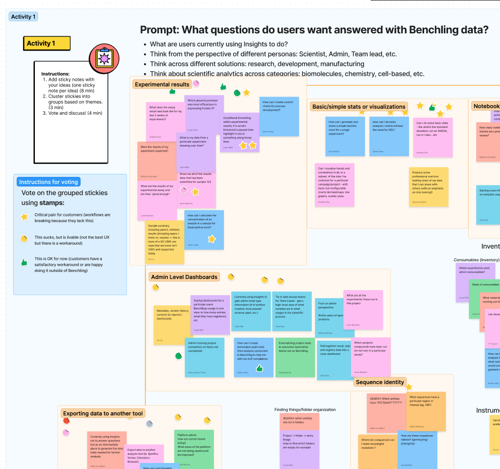
Kickoff sprint
When we kicked off this project, “analysis” at Benchling meant many things (and thus touched many teams): dashboards, reports, SQL queries, integrations. To align stakeholders and carve our a clear product direction, I led a week-long design sprint with teammates from product, design, engineering, strategy, and field.
We synthesized past research, audited existing tools, and mapped out the landscape of analytics needs across Benchling. Most importantly, we defined where our product would play.
Defining the opportunity
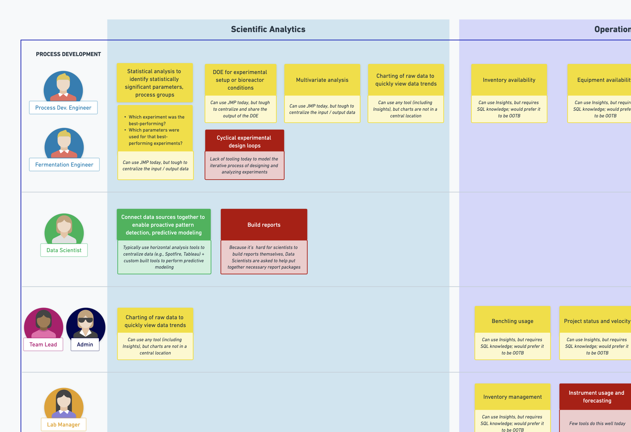
What emerged from the sprint was clear: the biggest unmet need was for research scientists who interpret experimental data but lack technical backgrounds in data science or SQL.
While our existing tools served data-savvy users and operational reporting needs, there was a whole segment of lab scientists who just wanted to answer questions like "What were the results of my assay?" without writing code.
“Supporting really basic analyses (e.g. t-tests) would probably get us 80% of scientific analysis use cases — from my POV, this seems like the #1 thing scientists need to extract quick insights from their data and to encourage them to put data into Benchling in the first place.”
“I find using Insights [existing SQL solution] wildly difficult. Every time I try to do even basic queries, I just give up… We like GUIs!”

Use cases we could address range from scientific (“What were the results of this assay?”) to operational (”How many notebook entries were reviewed this week?”) to a combination of both (”How is this control performing over time?”). There are also varying personas involved, with different levels of data proficiency—from bench scientists who may not be able to code and have a basic understanding of data systems, to data scientists responsible for managing multiple data pipelines.
The challenge became: How can we help research scientists transform raw experimental data and visualize trends in common scientific experiments - without requiring SQL or coding skills?
Research
To design something scientists would actually use, I talked to customers and internal subject matter experts and dove into details of common lab assays to understand how scientists take raw data from instruments and translate them into meaningful insights.
What we learned:
Analysis leads to reporting. Scientists analyze data to draw conclusions and share progress.
Not everyone’s data-savvy. Lab scientists know analysis software, but struggle to write queries, joins, or combine data from multiple sources. They want point-and-click, not code.
Exploration over automation. For science teams in early research, analysis is messy, iterative, and open-ended. (This differs from teams in development and manufacturing, where assays and analyses are standardized.)
Analysis is branching. Scientists often need to view the same data at different levels. For example:
Heat map of plate results
Table of results by standards
Table of average results per sample
Table of a plate’s summary statistics
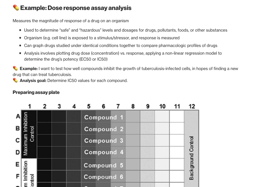
We dove deep to learn from scientists! Here’s an excerpt from a write-up I did about how to analyze a dose-response assay.
Early Concepts
Based on these research insights, our engineering team chose to model analyses as a Directed Acyclic Graph (DAG), where the nodes are datasets and the arrows are “analysis steps”, a data transformation that takes dataset(s) as input and outputs other datasets or charts.

With this understanding, my early concepts were UI frameworks for showing relationships between data inputs and outputs.


Using principles to guide decision-making
We had several promising concepts, but without definitive feedback from users or the team, we were stuck without a clear direction.
So, I went back to our research findings. Working with my PM, we aligned on a set of product principles based on research that we then used to evaluate design concepts:
Analysis leads to reporting → Outputs should be organized.
Scientists aren’t always data-savvy → Follow conventional data analysis UX.
Exploratory over repeatable → Support iterative, exploratory experiences
Analysis is branching → Parent/child relationships should be obvious
These principles became our North Star, and we used them to turn subjective opinions into objective decisions.
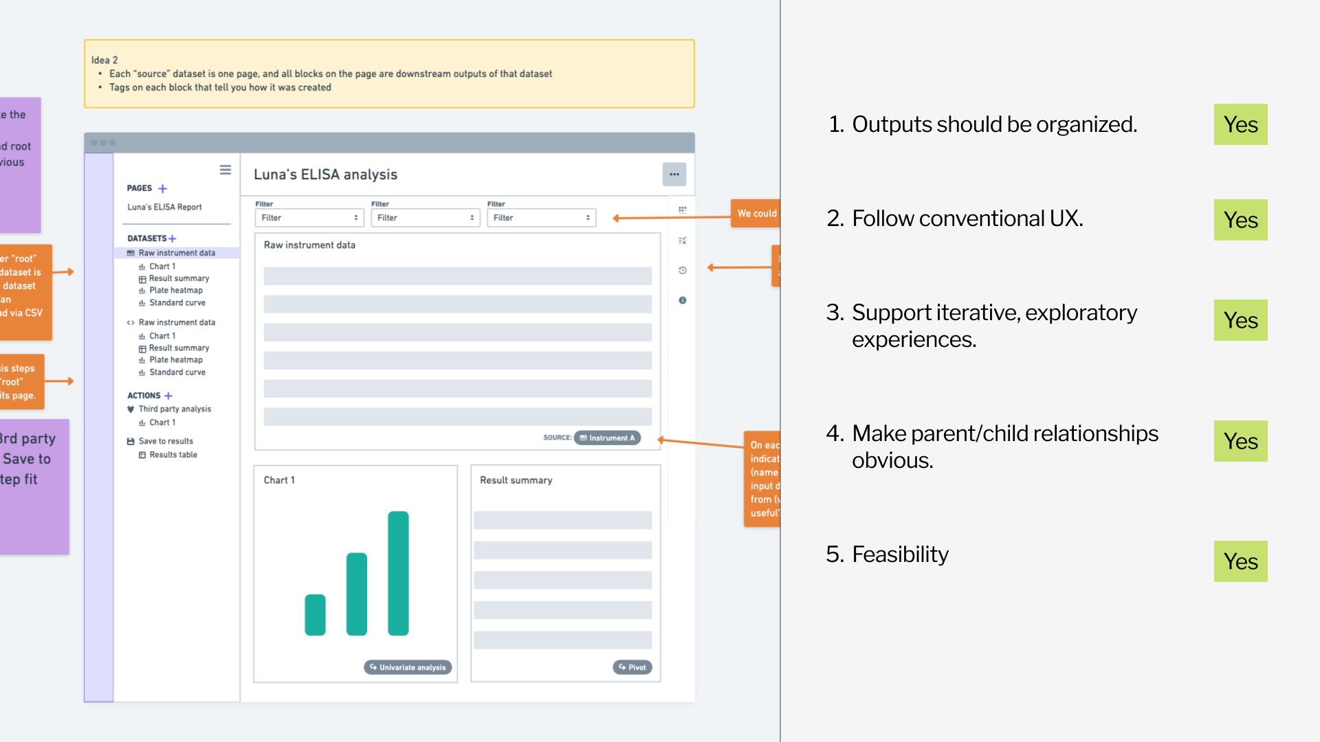
The winning concept groups all downstream charts and tables that flow from each parent dataset—making relationships clear while supporting iterative exploration.
Design x Product x Engineering collaboration
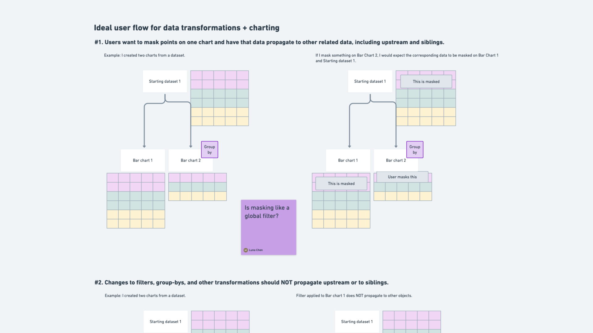
As we moved into detailed design, I realized that showing mockups wasn't enough to communicate the behavior we needed. What happens when a scientist masks a data point in one chart? How does that affect downstream visualizations?
To bridge the gap, I created visual diagrams that explained data transformations and their ripple effects through the analysis. These diagrams became a shared language for the entire team, aligning mental models across functions.
Elevating design craft and delight through details
When I started this project, I thought data analysis was something scientists just had to get through… a means to an end.
But during research, I discovered something unexpected: seeing results come in after days of experiments is the most exciting part of their job. (I didn’t realize data analysis could be… joyful! ✨)
That insight changed how I approached the design. If this was a meaningful, even emotional moment, the tool should feel that way too. I introduced small moments of delight - custom chart icons, thoughtful use of color, and smooth transitions - subtle cues to make the product feel approachable and even delightful.
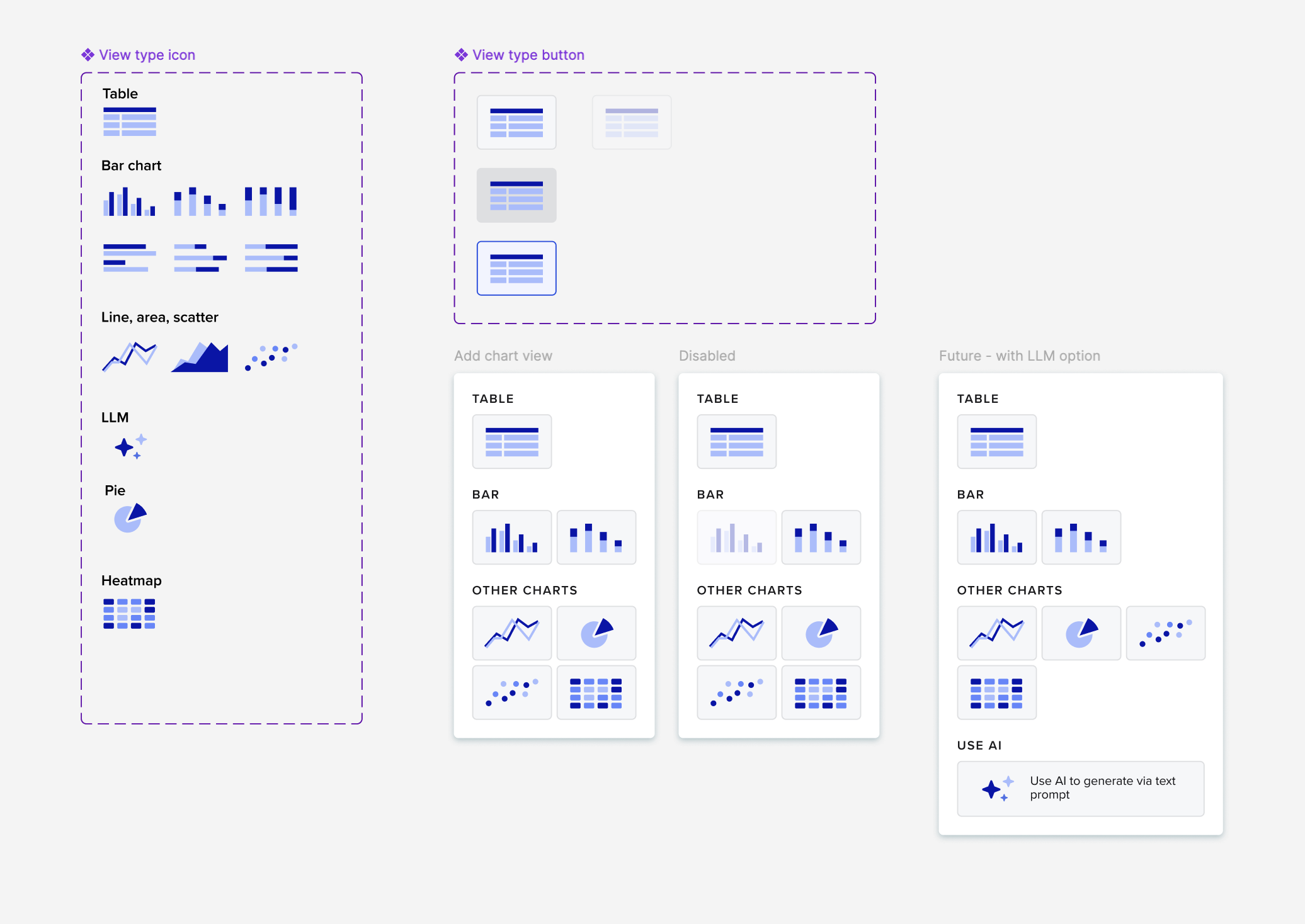
A couple months prior, I worked on a platform-wide icons revamp. Our new icon set came with duotone icons that I incorporated for a fun touch, along with these custom menu items inspired by them. We don’t have a lot of visually interesting details in Benchling, so this was something new.
Later, other designers started to incorporate the duotone icons into their own product areas, and I feel proud that I've raised the bar for design craft at Benchling in a small way!
The solution
From raw data to insights, all in one place
With the launch of this new analysis tool, scientists can now:
💖 Combine, filter, and visualize datasets within Benchling
💖 Build and iterate on analyses without writing code
💖 Maintain full traceability across experiments
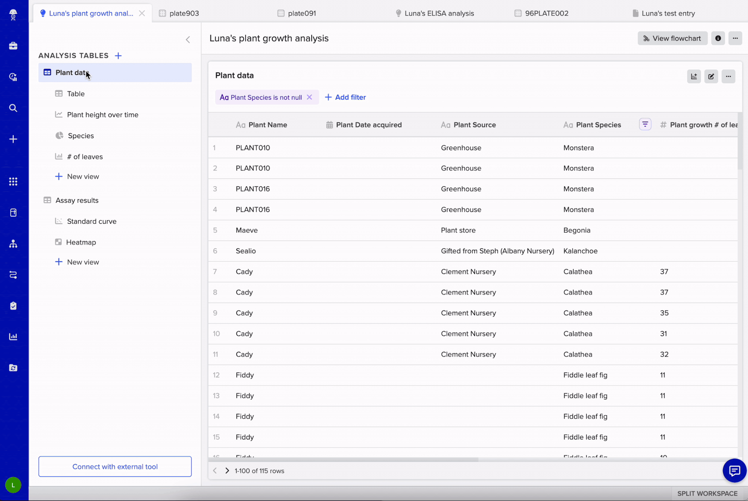
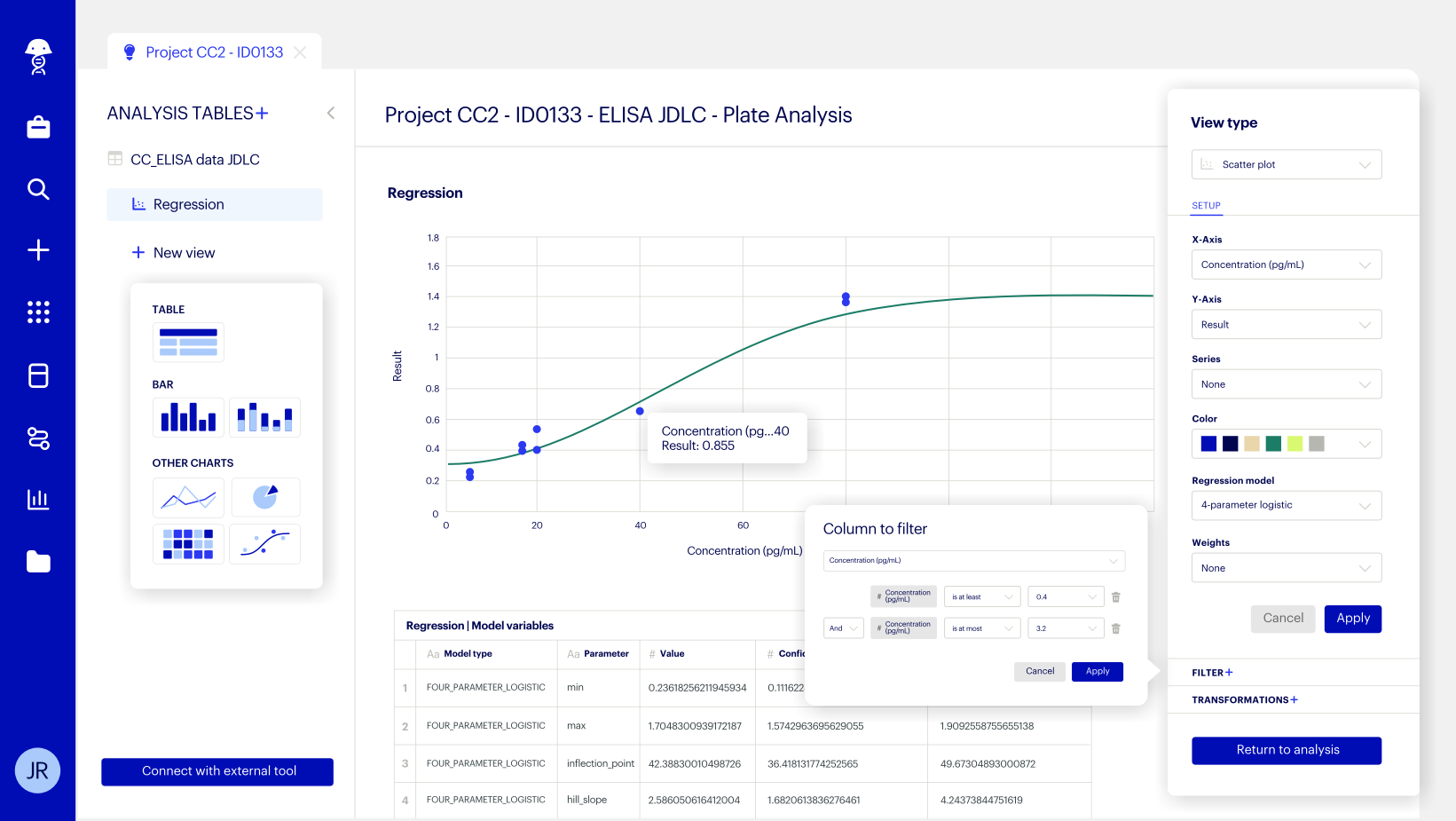
Query data from Benchling without writing SQL: We built a point-and-click dataset creation tool that allows users to traverse data structures to curate tables with all the metadata they want.
Add multiple views (tables or charts) from the same set of data: This enables common scientific use cases that require aggregating data at different levels, such as “Show me averaged results by sample and individual results by replicate”.
See charts and tables: The analysis tool allows users to join, transform and chart data, as well as apply assay acceptance criteria by creating filters, writing logical formulas, and calculating standard deviations.
Edit a view: Views can also be used to filter and section data for further transformation. For example, '“Create a standard curve with only results from wells marked as [Standards]”.
Impact
The tool has become a key selling point in enterprise deals, including with a major pharmaceutical company. It’s a win for both sides:
Scientists ❤️ the intuitive experience and sense of ownership over their data.
IT and business stakeholders ❤️ the traceability and platform consolidation.
“I want to share a kinda wow moment from the customer when I showed them Analysis... I combined the tables and unpivoted some columns to align the offline titer with DO online readings... the sheer impact of having these two lines on this graph got a reaction from the customer, saying this is the “holy grail” of bioprocess.”
“We are signing a deal where the client has restriction on our analysis capability (this is one thing our competition used to hold against us). Now, we are fighting back - we did a demo and they have chosen us. So thank you so much!”
“For a beta mode, I am really impressed with how far charting is coming along. I’m grateful for the work and think it will be hugely consequential for our team.”
“We met with 10+ customer to discuss analysis tool capabilities and direction over the past ~3 weeks... We were able to show them that our Analysis Tool is capable of doing operations they originally assumed there’d be no way to do via point and click. Value is being placed on lowering the barrier of entry to democratize analysis creation between wet lab scientists and their supporting biostatician team. ”
What I learned
Clarity is a superpower
By using diagrams, flowcharts, and storyboards to communicate complex technical concepts, I influenced product strategy and unblocked engineers - often more effectively than showing UI mockups.
Keep humans at the center
Rather than simply translating backend decisions to the frontend, I advocated for user-friendly concepts and terminologies that resonate with scientists who don’t typically have a data science background.
Principles turn ambiguity into progress
Defining and aligning around shared principles turned ambiguity into progress. If I could do this project again, I would have done this even sooner to drive decisions faster.
Focus on leverage, not coverage
I learned to prioritize the high-impact decisions that clarify direction or unblock teams, rather than trying to solve every edge case upfront.