Plate maps: Visualizing experimental layouts on a well plate
What
Plate map tool for scientists to annotate metadata on wells of a plate
Who
Lead Product Designer, working closely with another Product Designer, Product Manager, and team of engineersWhen
2024 (Feature released in limited availability as of June 2024)
Benchling is a cloud platform for life sciences R&D, helping scientists track experiments and capture data. Almost every Benchling customer uses plates in the lab in some capacity, but we don’t support plate-based workflows as well as we’d like.
In 2024, I worked on an interactive plate map tool that allows scientists to visually design plates by selecting and annotating wells with metadata. As of June 2024, this feature is currently in LA (released in Limited Availability).
Problem

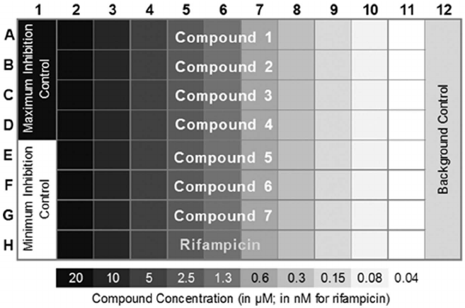
A customer example of a plate map drafted in Google Sheets, depicting important metadata to be captured on wells as separate layers of information.
Plate maps have two main uses:
1. Visualizing a plate during experiment design: Experiment planners need to decide how to arrange samples, controls, standards, and reagents on a plate. Some factors they may consider include: the dimensions of the plate, number of samples to be tested, real-world experimental effects (e.g. evaporation effects on the edges), and even personal preference. Lab scientists want to see this visual map of the plate (in “plate format”) to assist with pipetting when actually executing the experiment.
2. Capture metadata for experiment analysis: Conditions and metadata associated with wells are needed for downstream analysis so that we can classify results for each well. Otherwise, we won’t know that well A1 contained “Positive control” while A2 had “Sample 1”, for example.

An analytical instrument may return raw results like this. However, this doesn’t tell you what was inside each well (was it a control? a sample?), preventing the user from performing analysis on these results.
What users want: ability to map well role (control, compound, etc.), concentration, and other metadata to wells, so that they can use the plate map to guide pipetting and for downstream analysis.
Plates play a key role in experiments, but we didn’t support plate-based workflows very well. As a result, most customers were using workarounds such as pasting in a picture of their plate layouts into notebook entries, or using simple tables to visually plan plate layouts (solves use case 1 but not 2), or just pasting in a picture of the plate layout from somewhere else (doesn’t solve either use case…)
Why was it important that we solve this problem?
Many real-life plates go unrecorded in Benchling because users find our current functionality unhelpful. By improving our plate map tools, we can encourage users to record more of their experimental processes. This is key to realizing the entirety of Benchling’s value proposition, as tracking the entire experimental process in Benchling enhances team collaboration and generates insights to accelerate R&D.
“One of the biggest challenges to registering samples in a plate is that scientists often design experimental plate layouts in an unstructured well plate table, but then need those values transferred to a tabular registration table... It has created a significant bottleneck to our high-throughput teams where sample registration becomes a nuisance to their workflow.”
“The only way to view the contents of a plate in Benchling is in a tabular format... This is useful for displaying many pieces of metadata for each well at once. However, this is not a format that is easy to visually parse for scientists who are often more used to plate maps where they can view plate contents in a matrix format that matches the layout of the plate itself. This leads to duplicate entry of information where the scientist will use inventory to record their plate layout in a structured format, and then create a separate, unstructured table to use as a plate map.”
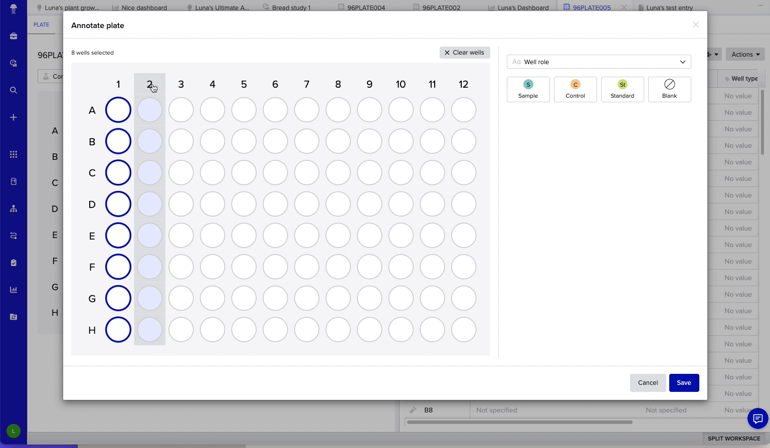
Our solution: An interactive plate map tool
My team and I worked on a new plate map wizard that allows scientists to visually annotate metadata on a plate. The key considerations for our MVP were:
Visually helpful: The tool should match the user’s mental model of what a plate looks like when planning experiments (vs. a tabular view, which is more helpful when analyzing an experiment)
Portable: This tool should be able to be accessed from multiple screens, such as notebook entries and inventory pages. (For us, this means it’s in a modal.)
Scalable: Plates come in varying dimensions, and we wanted to support up to 384-well plates. According to usage data, 96-well (12 by 8) is the most commonly used size, and what we optimized for.
Using simple click-and-drag interactions, users can select wells of interest - then write in custom text labels to annotate plates with the metadata you want.
In some cases, multiple labels may need to be placed on the same well - for example, to represent multiple reagents to be placed inside a well. We handle this by splitting wells with color, and a special treatment for over >4 labels.
We handle numeric metadata too! This is great for visualizing dilutions, and numeric metadata such as pH.
A key consideration was to make plate map components reusable across multiple contexts. In the context of notebook entries, plate maps can be used to guide scientists at the bench when pipetting.
Impact
After a brief beta period in early 2024, we released MVP plate maps in limited availability. Since then, we’ve made iterative improvements to the plate tool, such as a new plate layers selector UI. I also led an investigation into better accessibility for colors on the plate map.
Plate maps will be launched more generally later this year. Our hypothesis is that the release of this tool will result in more plates being recorded in Benchling, unlocking more of Benchling’s value around tracking experimental processes and providing key insights to accelerate R&D.
“This is useful for modeling metadata. Assigning schema fields to wells was a lot quicker and easier than I thought.”
“We really need this, I don’t see it as a “nice to have” at all. I can quickly see that something is only in one row, without having to know what the colors mean necessarily.”
“As a mildly colorblind person, I’d just want to provide some feedback that the multiple colors make it rather difficult to tell certain wells apart from one another. Future versions might want to think about accessibility using textures.”
That was just a peek into this project - there’s a lot more good stuff to share! For a full look at my process, contact me.