Benchling analysis
Making meaningful sense of experimental data.
Benchling is the leading cloud platform for biotech R&D. I led design on a no-code charting and data transformation tool for scientists to interpret experimental results. This was the first product in Benchling's ecosystem that requires no up-front configuration, and I championed this shift from rigid applications to a more flexible approach that empowers scientists from the very first click.
As Lead Product Designer, I drove research and strategy while establishing the foundational UX patterns and polished designs for launch. I also guided two designers who focused on charting details and complex regressions.
Role
Lead Product Designer
Team
1 product manager
3 engineers
2 designers (partial)
TIMELINE
2023 (Launched 2024)
The problem
A critical gap in the life of an experiment.
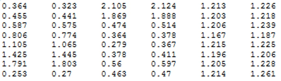
Raw assay results look like this — a jumble of numbers! To make meaningful sense of this, scientists need to process it into the right format, combine with metadata, then slice and dice the data in different ways to answer questions like: Did my experiment go as planned? Were there any outliers? What are the results of this assay?
Science teams rely on Benchling to plan experiments and record data, but for a long time, the platform lacked an easy way for scientists to analyze and visualize experimental data. This meant that after weeks of lab work, scientists had to leave Benchling to interpret scientific results—putting an end to their workflow, right when things got interesting!
While Benchling offered an existing analytics tool, it required SQL. Since most lab scientists don’t write code, this gap forced R&D teams into fragmented workflows and multiple sources of truth. Hard-won experimental insights often never made it back into Benchling, breaking our promise of a unified platform.
The opportunity
Point-and-click, not code.
“I find using [existing tool] wildly difficult. Every time I try to do even basic queries, I just give up… We like GUIs!”
— Benchling user
We wanted to give scientists the superpowers of a data analyst without requiring them to write a single line of code. Our goal was to build a point-and-click tool that could handle complex regressions, mask outliers, and create beautiful visualizations—all while staying accessible to non-experts.
In June 2024, we launched Insights Analysis, allowing scientists to transform raw data into meaningful results with just a few clicks. ✨
01 / Kickoff sprint
Moving past ambiguity to build a shared vision.
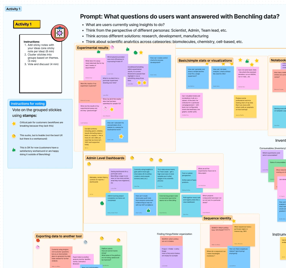
The biggest challenge early on was defining what "Analysis" actually meant. Because Benchling stores so much data, our customers wanted to access it in vastly different ways—from program leads tracking notebook entry completion to researchers examining cross-assay results. Internally, it also touched many teams, from dashboards to integrations.
To find our focus, I led a week-long design sprint with partners from product, engineering, strategy, and customer success. We audited existing tools and mapped the landscape to answer the hard questions: Who are we building for? What data questions should we prioritize?
“Supporting really basic analyses (e.g. t-tests) would probably get us 80% of scientific analysis use cases — from my POV, this seems like the #1 thing scientists need to extract quick insights from their data and to encourage them to put data into Benchling in the first place.”
— Benchling Product Manager
02 / Research
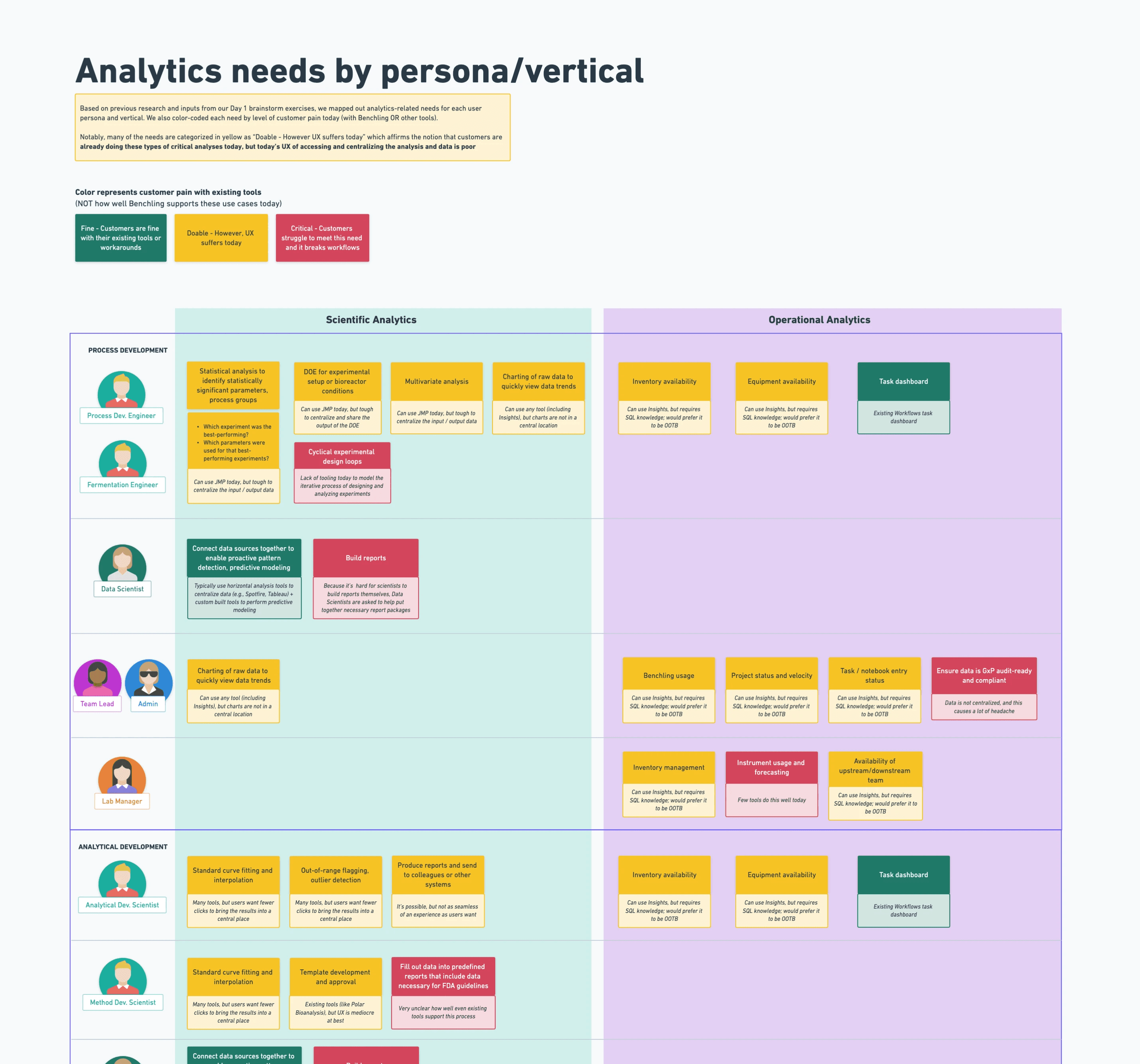
Deep dive into assay analysis.
We talked to customers and internal subject matter experts and studied common assay analyses to understand how scientists take raw data from instruments and translate them into meaningful insights.
What we learned
Analysis leads to reporting.
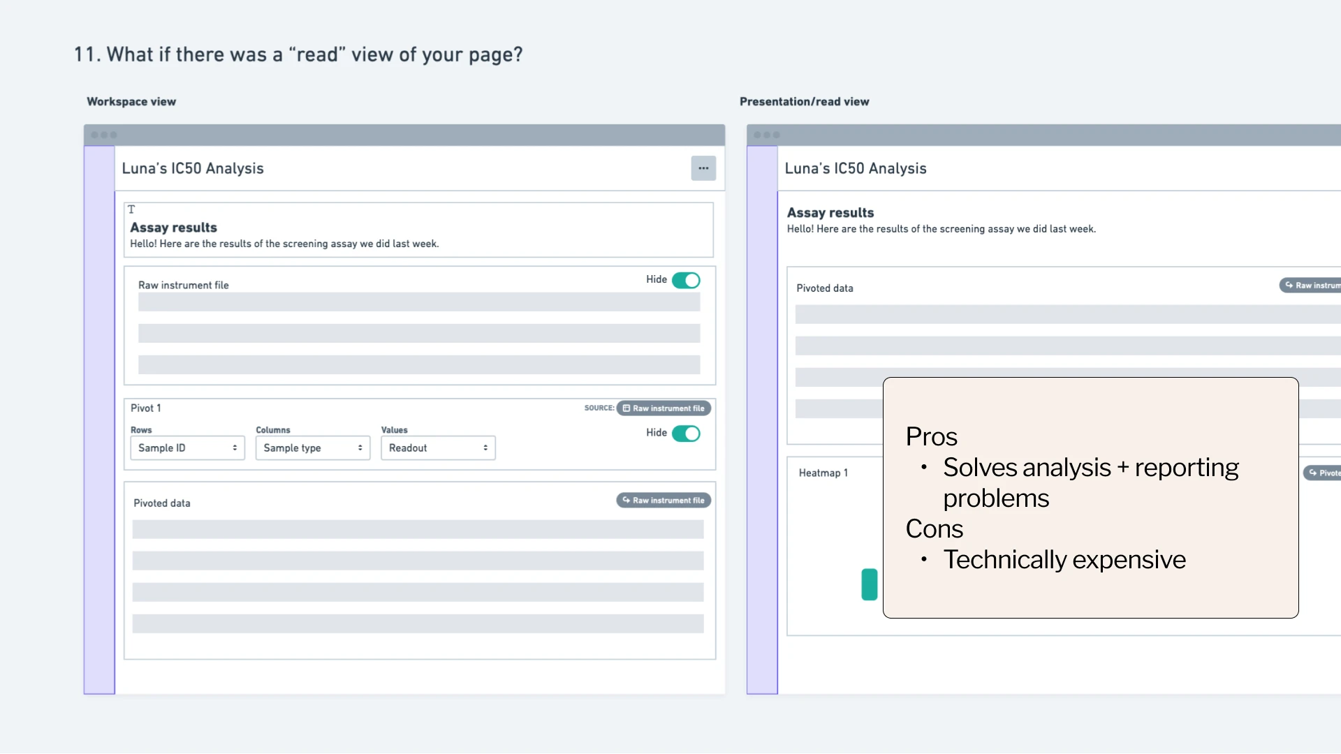
Scientists analyze data to draw conclusions and share progress. After analysis, key charts and figures are exported back to a shareable format, such as a Benchling notebook entry or slides.
Not everyone’s data-savvy.
Lab scientists know analysis software, but struggle to write queries, joins, or combine data from multiple sources. They want point-and-click, not code.
Exploration over automation.
For science teams in early research, analysis is messy, iterative, and open-ended.
This differs from teams in development and manufacturing, where assays and analyses are standardized.
Analysis is branching.
Analyses start by curating a giant dataset that gets sliced and diced at different levels. For example, for one assay analysis, a scientist might want to see:
Heat map of results per well
Table of results by standards
Table of average results per sample
Table of a plate’s summary statistics
03 / Defining the opportunity
Building for curiosity, not just compliance.
Our research made one thing clear: the biggest unmet need was for early research scientists who lacked a coding background.
We made a strategic choice to prioritize the "messy" exploratory needs of early research, even though it was the more difficult path. While it would have been easier to build a rigid, standardized tool—leveraging Benchling's existing patterns for structured data capture—we knew that true scientific discovery involves creativity and iteration.
Building for curiosity meant moving away from heavy up-front configuration and instead defining entirely new, interactive design patterns that could adapt as quickly as a scientist's hypotheses.
How might we empower research scientists to explore and analyze data so that they can interpret experimental results?
04 / Early Concepts
Developing a scalable UX framework.
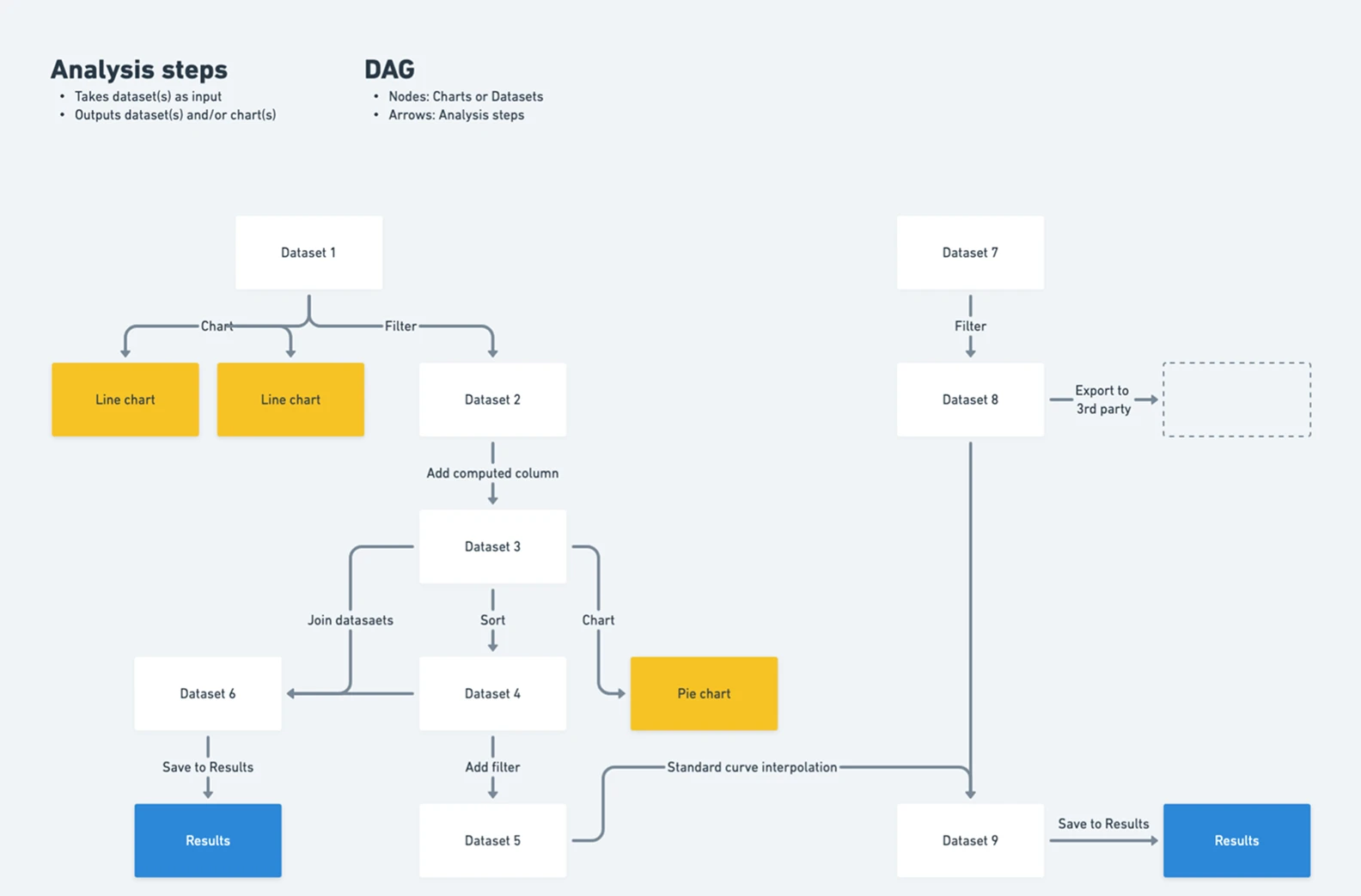
Based on our research insights, our engineering team chose to model analyses as a Directed Acyclic Graph (DAG), where the nodes are datasets and the arrows are analysis steps, or data transformations. While technically robust, my challenge was to translate this complex logic into something that felt effortless for a scientist to navigate.
My early concepts were UX frameworks for showing relationships between analysis step inputs and outputs.
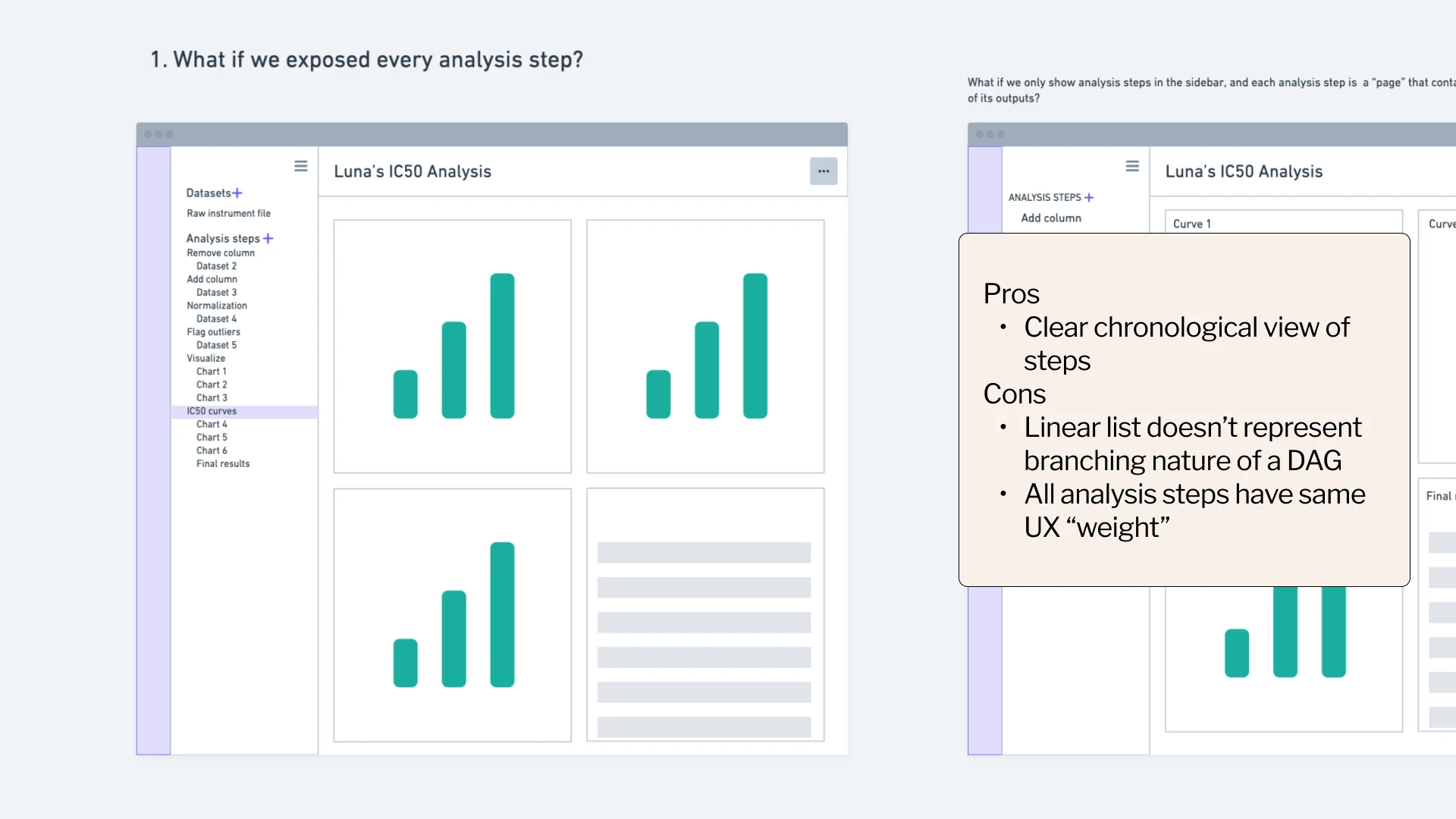
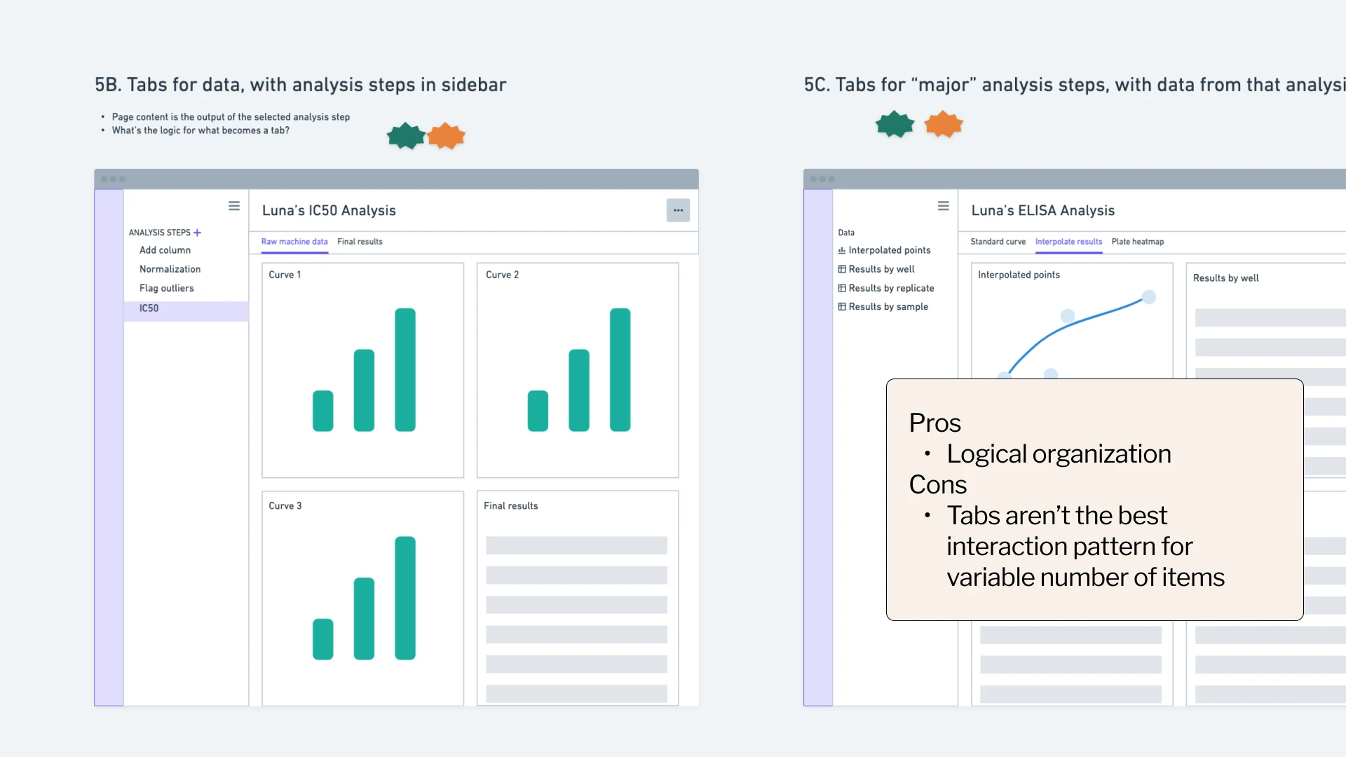
05 / Principle driven decision making
Translating research insights into design decisions.
We had several promising concepts, but without definitive feedback from users or the team, I was stuck without a clear direction.
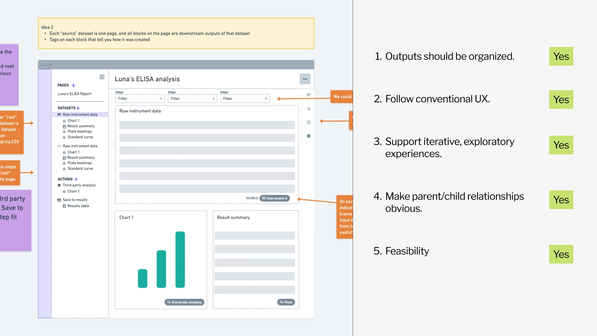
So, we went back to our research findings. My product manager and I aligned on a set of product principles based on research to evaluate design concepts, turning subjective opinions into objective decisions.
UX Principles
Analysis leads to reporting →
Outputs should be organized.
Not everyone's data-savvy →
Follow conventional data analysis UX.
Exploratory over repeatable →
Support iterative, exploratory experiences
Analysis is branching →
Parent/child relationships should be obvious
The winning concept groups all downstream charts and tables that flow from each parent dataset—making relationships clear while supporting iterative exploration.
06 / Speaking a shared language
Bridging the gap between design and engineering
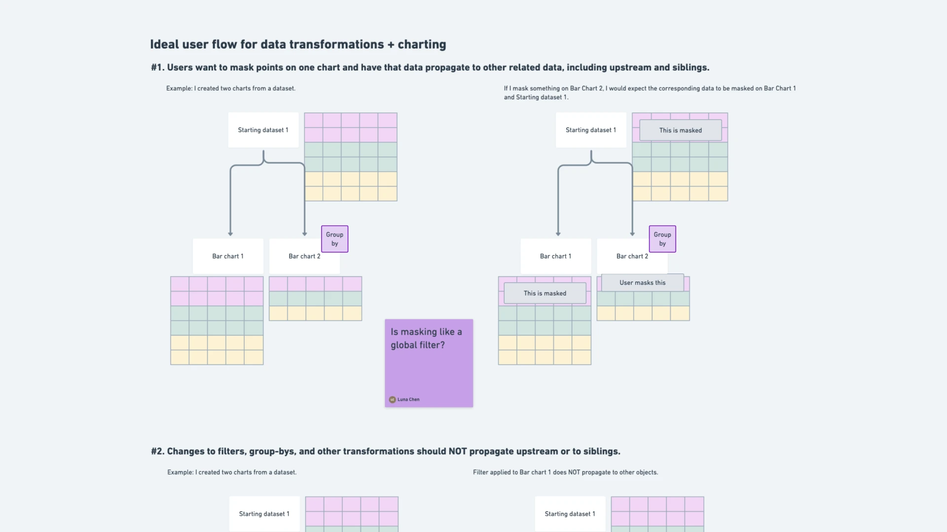
As we moved into detailed design, I realized that showing static mockups wasn't enough to communicate the behavior we needed. What happens when a scientist masks a data point in one chart? How does that affect downstream visualizations?
To bridge the gap, I created visual diagrams that explained data transformations and their ripple effects through the analysis. These diagrams became our team’s shared language, aligning our mental models across functions and ensuring that engineers, PMs, and designers were all building toward the same behavioral logic.
07 / Designing for delight
Analysis can be... joyful?
I used to think data analysis was the boring and dry part of an experiment, but scientists told us otherwise. Seeing results come in after days of work is actually the most exciting part of their job.
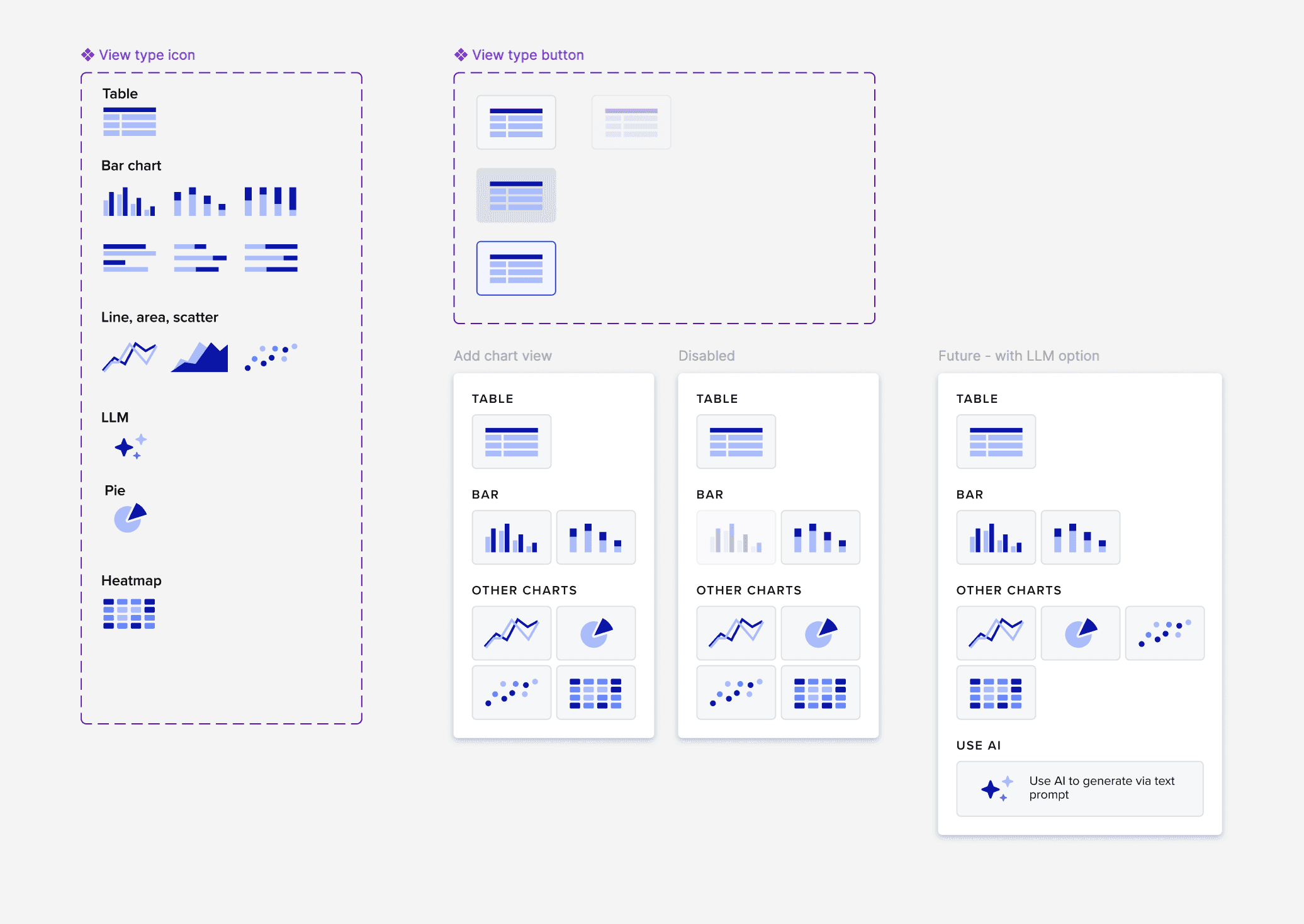
I mirrored this excitement by introducing small moments of delight—custom duotone icons, a thoughtful color palette, and intentional micro-interactions—to lower the emotional barrier to entry for complex data tasks. This raised the bar for design craft at Benchling, setting a new precedent for how the platform balances technical depth with visual delight.
08 / Final Solution
From raw data to insights, all in one place
With the launch of this new analysis tool, scientists can now:
💖 Combine, filter, and visualize datasets within Benchling
💖 Build and iterate on analyses without writing code
💖 Maintain full traceability across experiments

Query data without writing SQL
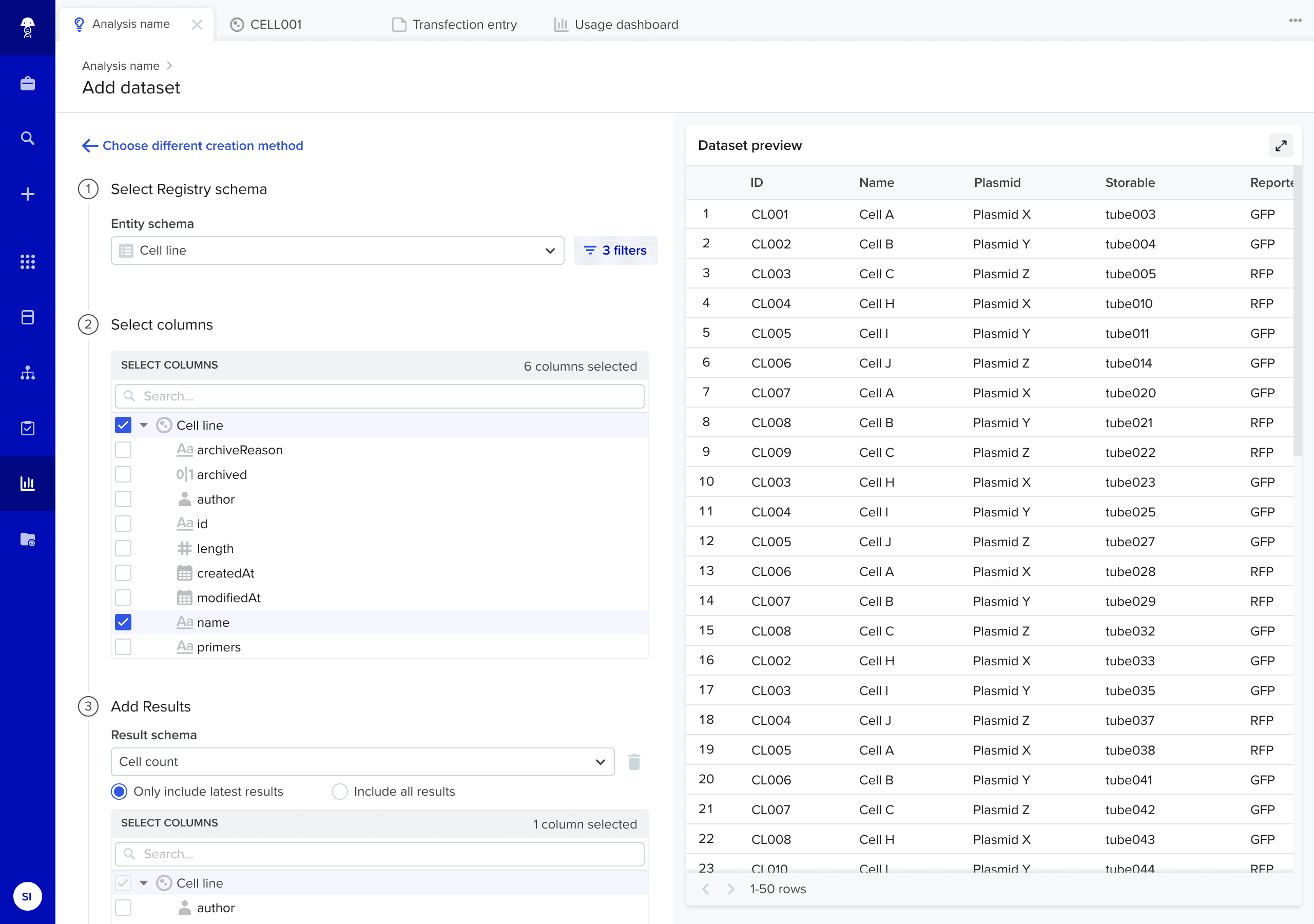
A point-and-click dataset creation tool allows users to traverse Benchling data structures to curate tables with all the metadata they want.
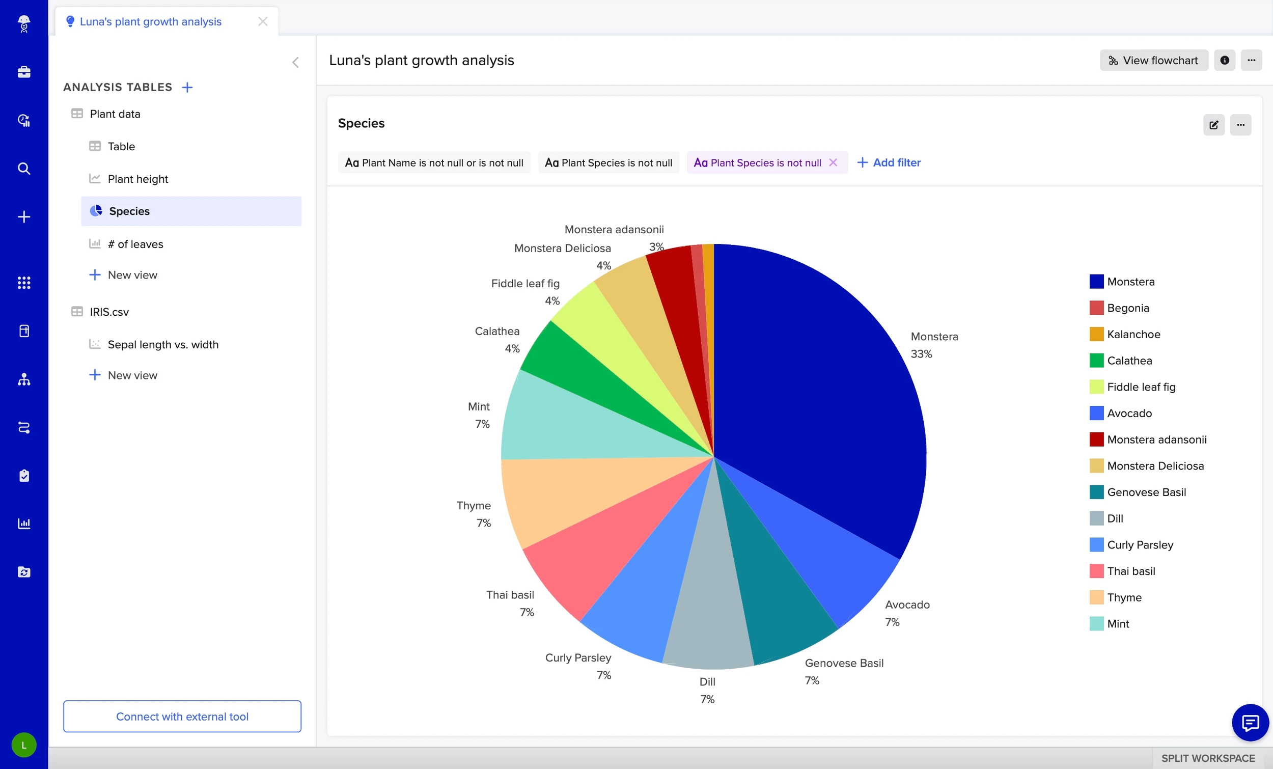
Slice and dice data with views
Views are "children" of top-level datasets. This allows for scientific use cases that require aggregating data at different levels, such as: "show me individual results per well vs. averaged results per sample".
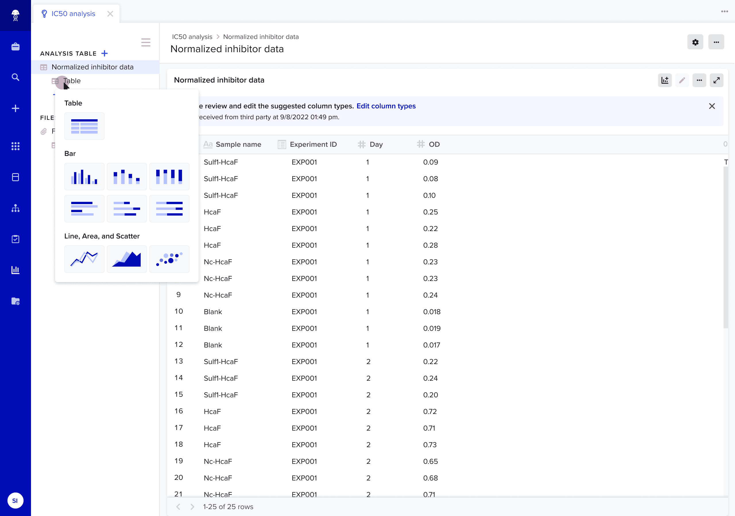
Visualize and transform data
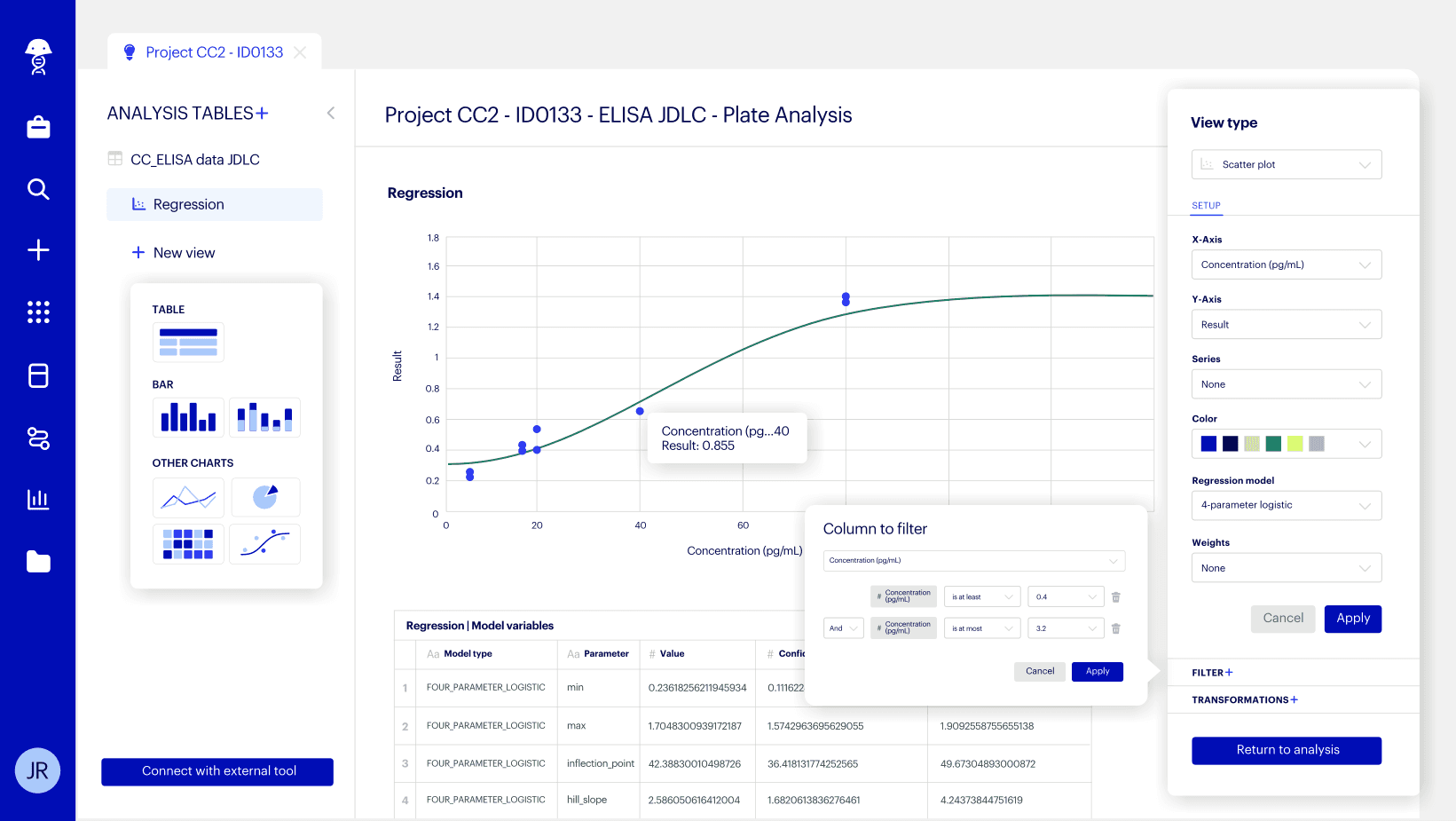
The tool enables users to join, transform and chart data, as well as apply assay acceptance criteria by creating filters, writing logical formulas, and calculating standard deviations.
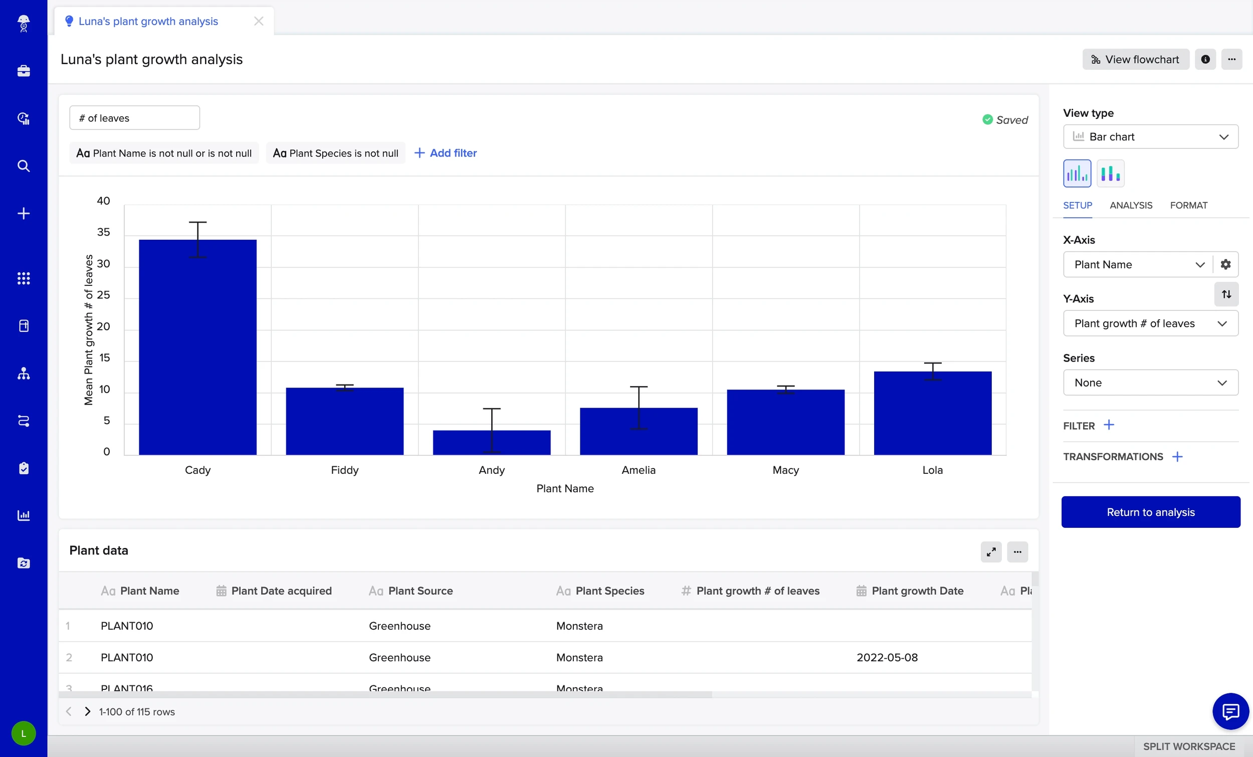
Interactive charting and data transformations
Apply filters and transforms to tables or charts with dynamic previews for instant feedback. This allows for precise data sectioning, for example to generate a standard curve using only rows of data marked as "Standards".
09 / Impact
Benchling's first tool that doesn't require up-front configuration.
Insights Analysis launched in limited availability in June 2024, with a general launch in August. (Note: I left Benchling in July 2024, and have intentionally omitted confidential success metrics here.)
Since launching, Insights Analysis has become a key selling point in enterprise deals, including an immediate contract with a global pharmaceutical company. It’s a win for both sides:
Scientists ❤️ the intuitive experience and sense of ownership over their data.
IT and business stakeholders ❤️ the traceability and platform consolidation.
Beyond the product itself, I’m proud of the influence this project had on our design culture. From being Benchling’s first launch that requires zero up-front configuration to the cute duotone icons, the UX paradigms and patterns I established were later adopted by other teams, helping raise the bar for design craft across the entire Benchling platform.
"For a beta mode, I am really impressed with how far charting is coming along. I'm grateful for the work and think it will be hugely consequential for our team."
— Beta Customer
“We met with 10+ customer to discuss analysis tool capabilities and direction over the past ~3 weeks... We were able to show them that our Analysis Tool is capable of doing operations they originally assumed there’d be no way to do via point and click. Value is being placed on lowering the barrier of entry to democratize analysis creation between wet lab scientists and their supporting biostatician team. ”
— Benchling Exec
